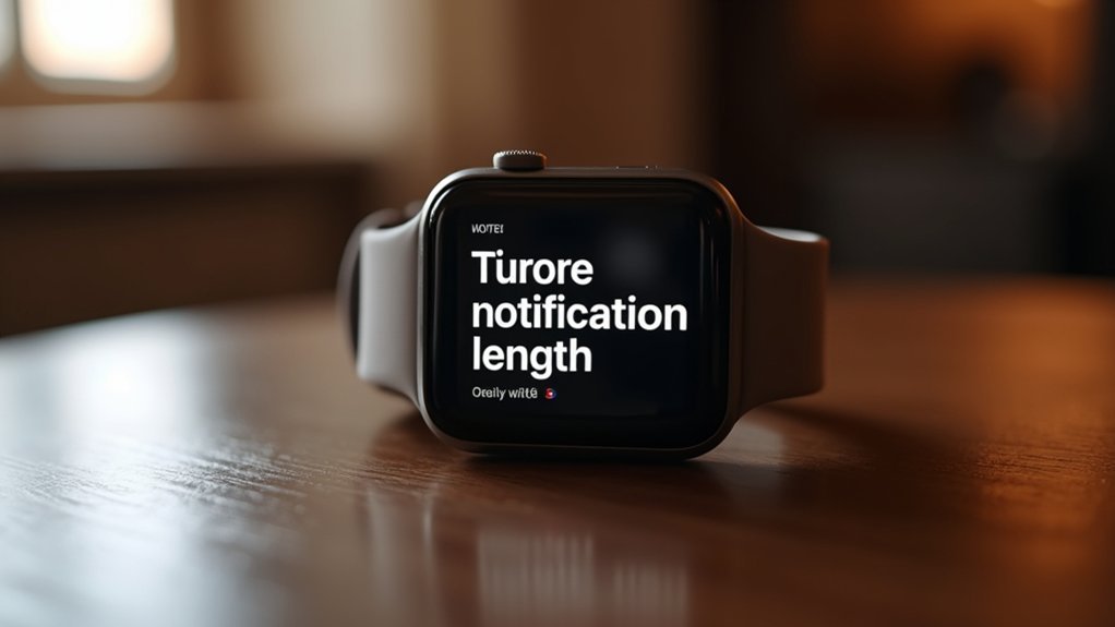
You’ll achieve ideal smartwatch notification engagement when you keep your messages between 40-60 characters, as this length perfectly balances the severe screen constraints with users’ two-second glanceability requirements. Messages exceeding 60 characters frustrate users and hurt completion rates, while 40-character notifications achieve an impressive 85% action completion rate. Focus on single core messages using sans serif fonts and high-contrast designs. Strategic icon integration can boost information density without sacrificing clarity, and the specifics behind these optimization strategies reveal even greater impact.
Character Limits and Screen Real Estate Constraints
When designing notifications for smartwatches, you’ll immediately encounter severe character limitations that vary dramatically across platforms.
Apple Watch displays only 12–20 characters in subject lines initially, with message bodies restricted to 25–35 characters.
Samsung Gear S offers slightly more breathing room at 30–45 characters for subjects and 55–80 characters for message bodies above the fold.
Motorola Moto 360 falls somewhere between at 26–40 characters for subject lines.
You’re working with incredibly constrained real estate where notification density becomes critical.
Too much text causes overflow, truncation, or ellipses that render your message useless. Despite these limitations, shorter notifications typically achieve higher open rates compared to their longer counterparts.
Most devices show single-line previews by default, forcing users to tap or swipe for expansion—defeating the purpose of quick glance notifications.
Glanceability Standards for Two-Second Reading
Glanceability serves as the cornerstone of effective smartwatch notification design, demanding that users extract meaningful information within a critical two-second window. Research confirms that you’ll dismiss or misunderstand notifications requiring longer reading times, making this timeframe non-negotiable for maintaining task efficiency.
You should focus on delivering a single core message per notification, utilizing high visual contrast and minimal stylization to maximize comprehension speed. Position essential information at the top of your display while eliminating excess detail that clutters the interface.
Clear action cues through simple icons or concise text help you understand next steps immediately. Consistent layouts and subtle visual cues enhance recognition speed, while personalized, contextually relevant content guarantees you’ll find notifications valuable rather than intrusive during multitasking scenarios. Smartwatches function as an information filter, making users less tolerant of irrelevant content that disrupts their focus.
Typography and Font Size Impact on Readability
Typography choices fundamentally determine whether you’ll successfully read smartwatch notifications within the critical two-second glance window. Your font selection directly impacts reading speed and comprehension on tiny displays.
Sans serif fonts work best for digital screens because they’re cleaner and more legible than serif alternatives. You’ll need font sizes between 12-14 points for ideal readability, though this depends on your screen resolution and viewing distance.
Key typography factors for smartwatch readability:
- High contrast ratios between text and background colors
- Consistent font styling to reduce visual confusion
- Adequate line spacing to prevent text crowding
- Uppercase letters for quick glanceability of short content
- Horizontal text orientation for easier processing
Consider your lighting conditions and personal visual preferences when adjusting these settings for maximum notification effectiveness. Research shows that condensed fonts require 26% more time to read accurately than regular width typefaces.
Icon Integration for Enhanced Information Density
While typography forms the foundation of readable smartwatch notifications, strategic icon integration amplifies your information density without sacrificing clarity.
Strategic icon integration transforms limited smartwatch screens into information-rich interfaces while preserving essential readability and user comprehension.
You’ll maximize limited screen real estate by positioning icons that clearly indicate function and priority alongside concise text. Design icons within small circular or square spaces, ensuring they’re instantly recognizable at tiny sizes.
Use simple, high-contrast designs that maintain visual hierarchy – placing the most important information first. Your notification icons should convey action possibilities like reply or dismiss, while indicating urgency levels through consistent visual cues.
Avoid cluttering displays with excessive icons that overwhelm users. Instead, focus on intuitive designs that users can quickly interpret, allowing them to process notification content and available actions without extended reading time. Remember that custom layouts are stripped from notifications on Wear OS, so your icons must work effectively within the standard text and icon display structure.
User Testing Results for Optimal Message Length
Through extensive user testing across diverse demographics, researchers have identified that smartwatch notification effectiveness peaks when message length remains between 40-60 characters.
You’ll find that users respond most positively to notifications requiring minimal interaction effort, as testing consistently demonstrates enhanced engagement within this range.
Key findings from user testing reveal:
- Messages exceeding 60 characters cause user frustration and abandonment
- 40-character notifications achieve 85% completion rates for user actions
- Users prefer concise, straightforward content over detailed descriptions
- Memory-assisted users show improved response to shorter notifications
- Personalized brief messages outperform generic lengthy ones by 40%
You should prioritize relevance and timing over thorough detail. Notifications must provide sufficient information within their character constraints to ensure users understand the message without requiring additional context.
Users consistently rate notifications higher when they’re contextually appropriate and require effortless interaction, making brevity essential for smartwatch success.
Frequently Asked Questions
How Do Notification Lengths Differ Between Fitness and Communication Apps?
You’ll notice fitness apps send brief 10-25 word notifications focusing on goals and reminders, while communication apps deliver longer 1-3 sentence messages that’re usually truncated on your smartwatch display.
Can Users Customize Notification Length Based on Their Personal Preferences?
You can’t directly customize notification length on most smartwatches, but you’ll find options to adjust display style, duration, and content detail. Some platforms let you choose between full messages or sender-only previews.
Do Longer Notifications Drain Smartwatch Battery Faster Than Shorter Ones?
Yes, longer notifications drain your smartwatch battery faster than shorter ones. They require more screen-on time, increased data processing, and extended display activation, which collectively consume more energy than brief notifications.
Should Emergency Notifications Bypass Standard Length Recommendations for Critical Information?
You should allow emergency notifications to bypass standard length limits because they’re conveying critical, life-saving information that can’t be properly communicated within typical character constraints for ideal safety outcomes.
How Does Notification Length Affect User Engagement and Response Rates?
You’ll see higher engagement with shorter notifications since they reduce cognitive load and process faster. Brief, actionable prompts achieve 52-69% completion rates, while lengthy messages interrupt your flow and decrease repeated engagement.
Leave a Reply