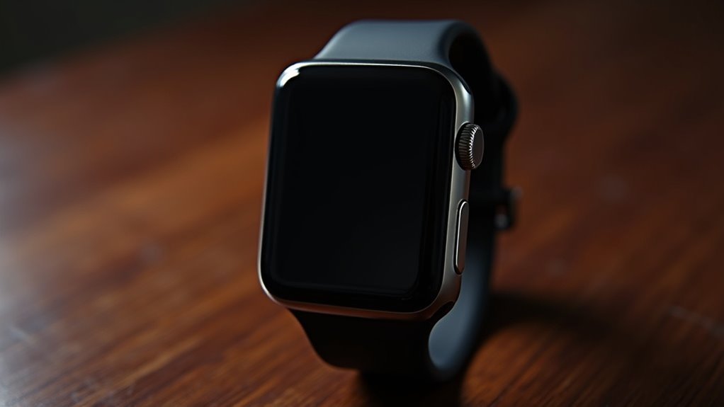
You’ll achieve ideal watch display readability by establishing contrast ratios above 1000:1, preferably 3000:1 to 10000:1, using bright saturated colors against deep black backgrounds. Create clear information hierarchy with 2-3 distinct element sizes, making primary data like current time larger than secondary information. Enhance your design for different screen technologies—OLED excels with true blacks while LCD requires careful consideration of viewing angles and ambient lighting conditions. These foundational principles reveal advanced visibility techniques.
Establish Strong Foreground-Background Contrast Ratios for Maximum Readability
When designing a watch display, you’ll need to establish strong foreground-background contrast ratios that guarantee maximum readability across various lighting conditions. Aim for contrast ratios consistently above 1000:1 for digital displays, though higher ratios between 3000:1 to 10000:1 deliver superior performance.
Choose bright, saturated foreground colors against deep black or low-reflectance backgrounds to maximize sharpness. Self-emissive technologies like LED and OLED provide excellent black levels, creating stronger contrast than traditional LCD displays. Avoid midtone combinations that create ambiguity between foreground and background elements.
Test your designs under various ambient lighting conditions to validate real-world performance, and always verify manufacturer contrast specifications with independent measurements using standardized AVIXA protocols for consistent results. The standard establishes five contrast ratios that correspond to different content viewing categories for optimal display performance.
Balance Element Sizing and Visual Weight for Clear Information Hierarchy
Effective hierarchy transforms your watch display from a cluttered collection of data into an intuitive, scannable interface that guides users naturally through information layers.
You’ll want to establish 2–3 distinct sizes for your elements, making primary information like current time considerably larger than secondary data such as date or battery indicators. This size variation creates visual weight that directs attention where it’s needed most.
Balance heavier elements with lighter ones to prevent overwhelming your users. Use strategic spacing between components to distinguish information layers clearly, and group related elements together to reinforce their connection.
Consider font weight variations—bold text for critical data, regular weight for supporting information. High contrast colors capture the eye more effectively than subtle variations, making essential information immediately distinguishable on your watch display. This proportional structuring guarantees your display remains both functional and aesthetically harmonious.
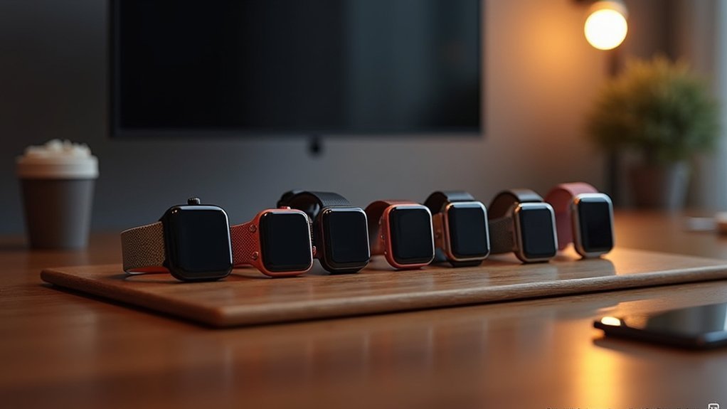
Optimize Display Performance Across Different Screen Technologies and Lighting Conditions
Your carefully crafted hierarchy means nothing if users can’t see it clearly across different devices and environments. Different screen technologies require tailored approaches to maintain contrast effectiveness.
OLED displays excel at delivering true blacks and vibrant colors, making them ideal for high-contrast designs. However, LCD screens with LED backlighting may struggle with viewing angles and contrast consistency. You’ll need to compensate by using stronger color differences and avoiding subtle gradients.
Consider these optimization strategies:
- Implement ambient light sensors to automatically adjust brightness and contrast based on environmental conditions.
- Design separate color schemes for bright outdoor conditions versus low-light indoor environments.
- Test your designs across multiple screen technologies including OLED, LCD, and e-ink displays.
Always prioritize readability over aesthetic preferences when adapting designs for different technologies. Maintain background brightness at 25% or below on the HSV scale to optimize power consumption while preserving contrast effectiveness.
Frequently Asked Questions
How Do I Test My Watch Design for Colorblind Accessibility?
You’ll need to use color contrast checkers and color blindness simulators to test your design. Check WCAG compliance ratios, gather feedback from colorblind users, and guarantee non-color visual cues work effectively.
What Gestalt Principles Work Best for Small Watch Displays?
You’ll find proximity and figure-ground principles most effective for small watch displays. They’ll help you group related elements clearly while maintaining strong contrast between foreground information and background, ensuring readability.
Should I Use Symmetrical or Asymmetrical Layouts for Watch Faces?
You should choose symmetrical layouts for classical, timeless appeal and easy readability, or asymmetrical designs for modern, avant-garde aesthetics that create visual interest and uniqueness in your watch face design.
How Much Negative Space Is Optimal on a Watch Dial?
You’ll want negative space to equal or slightly exceed your functional elements’ area. Aim for sub-dials at one-third the main dial’s diameter, ensuring hands and markers breathe without crowding for maximum readability.
Which Color Combinations Cause the Most Eye Strain During Extended Wear?
You’ll experience the most eye strain from neon yellow and red combinations, bright white backgrounds with saturated text, and high contrast black-on-white displays that force your eyes to work harder processing visual information.

Leave a Reply