You’ll want to activate high contrast mode and avoid red-green color combinations when setting up your watch display for color vision deficiency. Configure grayscale modes or choose blue-orange palettes instead of problematic red-green pairings that affect 8% of males. Adjust brightness controls for peak readability and guarantee notifications use distinct icons alongside color coding. Test different lighting conditions and utilize vibration patterns to supplement visual alerts. These foundational steps reveal advanced accessibility features.
Understanding Color Vision Deficiency Types in Watch Display Design
When designing watch displays for accessibility, you’ll need to understand that color vision deficiency affects millions of users worldwide, with red-green color blindness being the most prevalent form. This condition impacts approximately 8% of males and less than 1% of females, making it a significant consideration for your design decisions.
You’ll encounter different severity levels within red-green deficiency. Deuteranomaly and protanomaly are milder forms that cause difficulty distinguishing certain shades, while protanopia and deuteranopia represent complete inability to perceive specific colors. The genetic basis for these conditions is carried on the X chromosome, which explains why males are more frequently affected than females.
Blue-yellow color blindness affects fewer users but still requires attention, with tritanopia being the more severe form. Complete color blindness, though rare at one in 33,000 people, means some users see only in grayscale, requiring entirely different design approaches.
Essential Display Settings for Enhanced Watch Visibility
Now that you understand the specific types of color vision deficiency your users face, you’ll need to implement the right display settings to accommodate their needs. Focus on establishing high-contrast configurations that emphasize differences between interface elements, making navigation intuitive for everyone.
| Setting Type | Primary Benefit | Implementation |
|---|---|---|
| High Contrast | Enhanced visibility | Emphasize element differences |
| Grayscale Mode | Eliminates color confusion | Complete color removal |
| Brightness Control | Improved distinction | Adjustable saturation levels |
You should also integrate customizable color filters that adjust displays for various vision deficiencies. Dark mode provides excellent contrast improvements, while color inversion helps distinguish elements. Don’t forget text size adjustment and clear font styles—they’re essential for reducing visual confusion and ensuring your watch remains accessible to all users. Consider incorporating patterns and textures as additional visual elements that don’t rely solely on color differentiation.
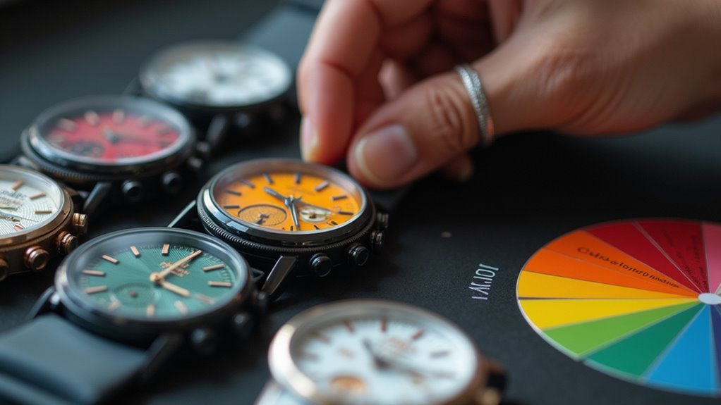
Color Palette Selection for Smartwatch Interfaces
When selecting colors for your smartwatch interface, you’ll need to focus on high contrast combinations that guarantee all elements remain clearly distinguishable.
You should avoid red-green pairings entirely, as these present the greatest challenge for users with the most common form of color blindness.
Testing your chosen palette with accessibility tools and color-blind users will help you verify that your interface works effectively for everyone. Additionally, implementing monochromatic color palettes can help differentiate screen elements while maintaining visual continuity across your smartwatch design.
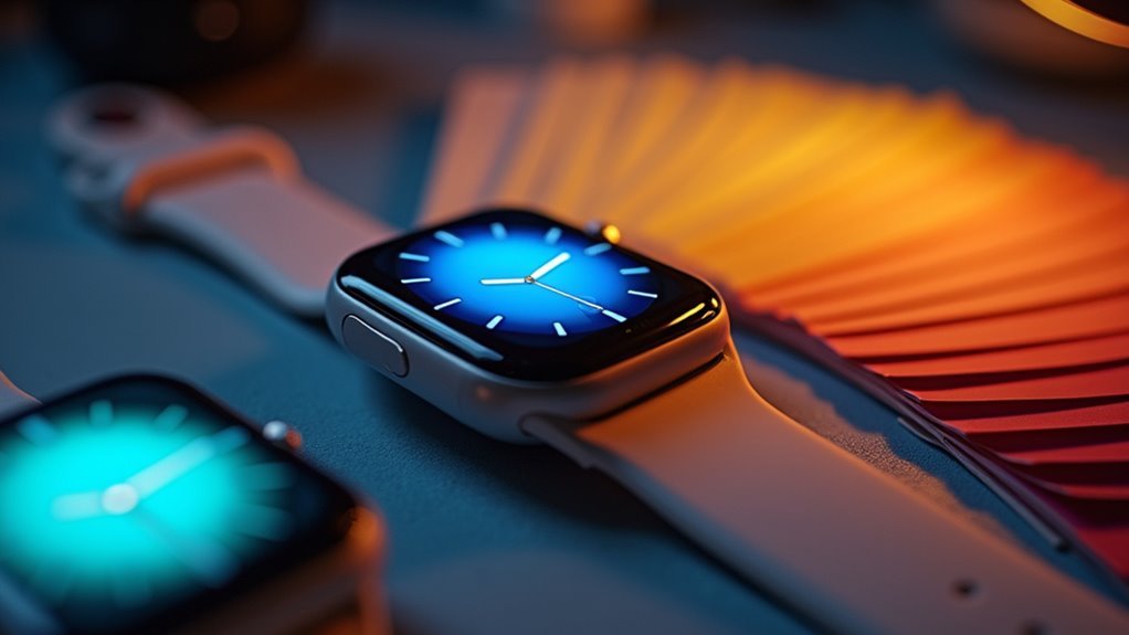
High Contrast Color Combinations
Since smartwatch screens demand instant readability in challenging conditions, you’ll need high contrast color combinations that cut through ambient light and support quick glances.
Dark backgrounds paired with bright accent colors maximize screen readability, while vibrant shades like bright green, Malibu blue, and sunset oranges create distinct visual hierarchies.
Your display technology influences palette effectiveness. AMOLED displays support wide color gamuts with rich, saturated colors, while E-Ink requires stark black-and-white contrasts for outdoor clarity.
For color-blind accessibility, choose blue and yellow hues with distinctly different luminance values. These combinations remain distinguishable across most color vision deficiencies while maintaining the vibrancy needed for quick information scanning in varying light conditions. Consider accessibility focused design principles that prioritize clear visual distinction over aesthetic preferences alone.
Avoiding Red-Green Pairings
Red-green color combinations create immediate barriers for users with the most common type of color vision deficiency, affecting roughly 8% of men and 0.5% of women who use smartwatches.
When you’re designing your watch interface, you’ll want to eliminate red-green pairings entirely from status indicators, notifications, and interactive elements.
Instead, you should choose color combinations that provide clear distinction for all users. Blue and orange work exceptionally well together, as do yellow and purple.
These alternatives maintain visual appeal while ensuring accessibility across your user base.
You can’t rely solely on color to convey critical information. Poor color choices lead to frustration and confusion, ultimately degrading the user experience. Accessible design practices benefit everyone who interacts with your smartwatch interface, creating a more intuitive and inclusive experience for all users regardless of their color vision capabilities.
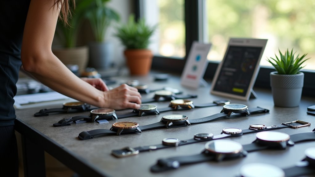
Testing Palette Accessibility
Testing your color palette’s accessibility requires a systematic approach that combines automated tools with real-world validation.
Start with automated contrast checkers to verify your palette meets WCAG guidelines—aim for minimum contrast ratios of 4.5:1 for standard text and 3:1 for large text. Use color blindness simulators like Coblis or Color Oracle to see how your interface appears to users with different vision conditions.
Conduct user testing with color-blind participants to gather direct feedback on your palette’s effectiveness. Track metrics like task completion rates and error rates for color-dependent actions.
Test your watch display under various lighting conditions, from bright sunlight to dim indoor settings. A/B testing different color combinations reveals which palettes perform best across diverse user groups. Given the limited screen space on smartwatches, prioritize core functionality when determining which elements require the most accessible color contrast.
High Contrast Mode Configuration for Sport Watches
You’ll find high contrast settings in your sport watch’s accessibility menu, where you can activate enhanced display modes that sharpen visual boundaries between interface elements.
Adjust your brightness levels to maximum recommended settings, as sport watches often operate in varying outdoor lighting conditions that can diminish screen visibility. For Galaxy Watch5 series models, you can enable high contrast fonts specifically designed to improve overall readability and visual clarity.
Customize available color filter options by selecting presets designed for different types of color vision deficiency, or manually adjust filters until you achieve ideal contrast for your specific needs.
Activating High Contrast Settings
Although color-coded interfaces work well for most users, sport watches offer high contrast mode as an essential accessibility feature that transforms displays into easily distinguishable black, white, and gray tones.
You’ll find activation methods vary by brand but remain straightforward. On Garmin devices, navigate to Settings > Display > High Contrast Theme.
Apple Watch users should go to Settings > Accessibility > Display & Text Size > Increase Contrast.
Samsung Galaxy Watch owners can access Settings > Accessibility > High Contrast or Custom Display Settings.
Third-party apps may offer similar toggle options. Changes apply immediately, though some watches require a restart for full effect.
Test the mode in various lighting conditions before relying on it during activities. Some users find frequent toggling between high contrast and standard modes necessary when transitioning between different environments, though this frequent toggling can become inconvenient during extended outdoor activities.
Adjusting Display Brightness Levels
Proper brightness adjustment serves as the foundation for effective high contrast mode, transforming your sport watch into a more accessible device that relies on luminance differences rather than color distinctions.
You’ll want to maximize the difference between light and dark display elements to enhance readability when color perception is compromised. Set your brightness high enough to create distinct separation between interface components without causing eye strain or glare.
Use your watch’s brightness controls to adapt to different lighting conditions—brighter settings for outdoor activities and moderate levels for indoor use.
Focus on creating sharp luminance contrasts that help you distinguish data points, icons, and text through light intensity rather than color variations, supporting all types of color vision deficiencies. Remember that these display adjustments can be modified at any time based on your comfort level and changing environmental conditions.
Customizing Color Filter Options
When configuring high contrast mode on your sport watch, color filter customization becomes your primary tool for creating displays that work effectively across different types of color vision deficiencies.
You’ll want to avoid problematic combinations like red-green, green-blue, green-gray, or blue-purple, as these create confusion for color-blind users. Instead, opt for blue-orange pairings or implement black-and-white schemes that guarantee universal accessibility.
Your watch’s built-in filters can enhance contrast by adjusting color intensity and brightness.
Test different settings using color-blind simulation tools to verify effectiveness across protanopia, deuteranopia, and tritanopia conditions. Evaluate your contrast requirements to ensure they meet accessibility standards for optimal visibility in various lighting conditions.
Enable personalization features that let you save preferred palettes, and regularly update your watch’s software to access improved accessibility options that manufacturers continue developing.
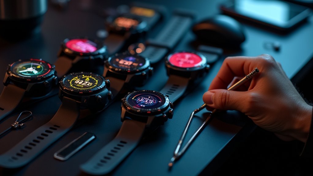
Customizing Watch Face Elements for Accessibility
Since color perception varies considerably among users with different types of color blindness, you’ll need to approach watch face customization with specific accessibility considerations in mind. You can enhance readability by selecting color schemes from ColorBrewer and utilizing color codes to personalize individual elements according to your visual needs.
| Element | Accessible Colors | Contrast Ratio |
|---|---|---|
| Hour Hand | White/Yellow | High |
| Minute Hand | Blue/Orange | Medium-High |
| Numbers | Black/White | Maximum |
| Background | Dark Gray/Navy | Variable |
| Complications | Green/Red Alternatives | Medium |
You should test your customizations using digital color simulators to verify they work for Protanomaly, Deuteranomaly, and Tritanomaly. Focus on maintaining sufficient contrast between elements while preserving visual harmony and functionality across all watch face components. Remember that information should not be conveyed solely through color, so consider incorporating text labels or distinct pattern variations to further enhance accessibility.
Testing Watch Display Visibility Across Different Lighting Conditions
Although you’ve customized your watch face for color accessibility, different lighting environments can dramatically alter how well you’ll actually see those carefully chosen elements.
Ambient light changes can make previously clear displays harder to read, especially when you’re moving between indoor and outdoor settings.
To guarantee your watch remains readable everywhere, test visibility under these key conditions:
- Bright sunlight – Check for glare and reduced contrast that might wash out your display
- Dim indoor lighting – Verify you can still distinguish elements when overall brightness drops
- Fluorescent office lighting – Test under artificial light that can shift color perception. Consider using color blind glasses if you have severe color vision deficiency to enhance contrast during testing.
- Transition periods – Practice reading your watch while moving between different lighting environments
Adaptive Technology Features in Modern Wearable Devices
Beyond manual adjustments and environmental testing, modern wearable devices now incorporate sophisticated adaptive technology features that automatically enhance visual accessibility for color-blind users.
Your smartwatch can detect ambient lighting conditions through built-in sensors and automatically adjust contrast and colors to match your specific needs. These devices use high-refresh screens with adaptive backlighting that improves visibility in various environments.
You’ll find that settings persist across all notifications, menus, and apps, ensuring consistent visual experience throughout your daily use. This comprehensive approach is particularly important since red-green color blindness represents the most prevalent form of color vision deficiency.
Many wearables support over-the-air updates that deliver new color correction algorithms, while some can synchronize with AR glasses or external correction systems for seamless integration across all your devices.
Optimizing Notification Systems for Color-Blind Watch Users
When your smartwatch delivers notifications through color-coded alerts alone, you’re likely missing critical information if you have color vision deficiency.
Modern wearables can accommodate your needs through thoughtful notification design that doesn’t rely solely on color differentiation.
To optimize your watch’s notification system for better accessibility:
- Enable distinct icons and symbols alongside color alerts to provide visual redundancy
- Activate vibration patterns that vary in intensity and rhythm for different notification types
- Turn on high-contrast text settings to improve readability across all lighting conditions
- Configure audio cues when possible to supplement visual notifications
Your smartwatch should also support screen reader compatibility and ARIA live regions for immediate announcements.
These features guarantee you’ll receive complete notification information regardless of color perception limitations. Consider requesting user testing with individuals who have color vision deficiency to evaluate how well your current settings work in practice.
Frequently Asked Questions
Which Smartwatch Brands Offer the Best Built-In Colorblind Accessibility Features?
Apple and Samsung offer the strongest colorblind accessibility features. You’ll find Apple excels with AI-powered visual aids and extensive ecosystem integration, while Samsung provides excellent color correction, grayscale modes, and customizable filters for your specific needs.
Can Third-Party Watch Apps Override Colorblind-Friendly Display Settings?
Third-party apps typically can’t override your watch’s system-wide colorblind settings like grayscale mode. They’ll offer their own color schemes, but these don’t affect your device’s built-in accessibility features.
Do Fitness Tracking Colors Remain Accessible During Intense Outdoor Activities?
You’ll find that intense outdoor lighting and glare can make color-coded fitness displays harder to read, especially if you’re color-blind, since environmental conditions often wash out the contrast you need.
How Often Should Colorblind Users Update Their Watch Display Calibration?
You should update your watch display calibration monthly to maintain color accuracy and accessibility features. If you notice color shifts, contrast issues, or after software updates, recalibrate immediately regardless of schedule.
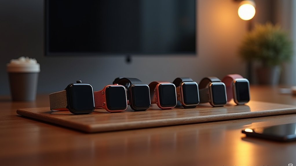
Are There Specific Watch Bands That Enhance Screen Visibility for Colorblind Users?
You won’t find specific watch bands designed to enhance screen visibility for color blindness. Instead, you’ll need to rely on your Apple Watch’s built-in accessibility settings like color filters and contrast adjustments.
In Summary
You’ve now got the tools to make your watch display work perfectly for your vision needs. Don’t settle for default settings that strain your eyes or make information hard to read. Take time to adjust contrast levels, select accessible color schemes, and test different lighting scenarios. Your smartwatch should enhance your daily life, not create barriers. These simple modifications will transform your wearable experience into something truly functional and comfortable.

Leave a Reply