You can dramatically improve your smartwatch’s readability by increasing font size through accessibility settings, adjusting contrast ratios to at least 4.5:1 for sharper text, and setting screen brightness between 70-90% with auto-adjustment enabled. Enable high-contrast display modes, choose bold sans-serif fonts, and guarantee adequate spacing between icons to prevent accidental taps. Use voice control features and customize vibration intensity for better notifications. These strategic modifications will transform your device into a perfectly accessible companion that adapts to your specific visual needs.
Font Size and Text Scaling Options for Enhanced Visibility
When you’re over 40, reading small text on a smartwatch screen becomes increasingly challenging, making font size adjustments one of the most critical accessibility features for older adults.
Large font sizes have the greatest positive impact on text legibility, reducing reading errors and increasing comfort markedly.
Larger text dramatically improves readability and reduces eye strain, making smartwatch use significantly more comfortable for users over 40.
You’ll find dedicated accessibility menus on most smartwatch platforms under settings like Accessibility > Vision enhancements.
These options let you increase both font size and boldness simultaneously for maximum emphasis. System-wide changes affect most apps and notifications, ensuring consistent readability across your device.
You can also use triple-tap and pinch gestures for magnification, while high-contrast fonts provide additional clarity alongside size adjustments. However, excessively large font sizes can actually decrease reading preference and overall user experience.
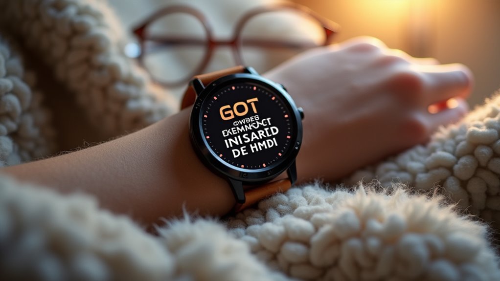
High Contrast Display Settings and Color Schemes
You can greatly improve your smartwatch’s readability by adjusting contrast ratios to create sharper distinctions between text and background colors.
Your watch should offer ideal contrast settings that make white text pop against dark backgrounds or guarantee black text stands out clearly on light surfaces. Many smartwatches designed for seniors include adjustable text sizes that work in conjunction with high-contrast displays to maximize visibility.
These color accessibility options let you customize display schemes that reduce eye strain while enhancing visibility in various lighting conditions.
Optimal Contrast Ratios
As visual acuity naturally declines with age, high contrast display settings become essential for making smartwatch screens readable and accessible for older adults.
You’ll need a minimum contrast ratio of 4.5:1 for small text against backgrounds to guarantee proper legibility. OLED and AMOLED display technologies offer true blacks that significantly enhance contrast when paired with bright text colors.
You should prioritize monochrome schemes like black text on white backgrounds, which provide the highest contrast levels. While complementary colors can enhance readability, they’re less effective than monochrome options.
Auto-adjustment features that modify brightness and contrast based on ambient light conditions will improve your reading experience across different environments. Customizable contrast settings allow you to personalize display preferences for ideal comfort and reduced eye strain.
Following these contrast principles helps ensure your smartwatch interface meets WCAG AA standards, which are increasingly referenced in accessibility litigation and promote digital inclusivity for users with visual impairments.
Color Accessibility Options
Beyond basic contrast adjustments, smartwatches must offer extensive color accessibility options that address the diverse visual needs of older users.
You’ll benefit from color switching capabilities that let you choose between different schemes, while background options help you find the most readable combinations. Display brightness adjustments improve visibility across various lighting conditions, and color inversion assists with visual impairments by reversing screen colors.
You should also look for customizable color features that allow personal adjustments based on your specific needs. High-visibility colors and contrasting text enhance readability markedly. Age-related changes in perception often cause difficulties with color differentiation, making these adjustments particularly crucial for maintaining clear visual communication.
Automatic color adjustment based on ambient light proves especially valuable, while color profiles for different conditions assure ideal visibility. These thorough options reduce errors, boost confidence, and create a more engaging smartwatch experience.
Screen Brightness Adjustment and Auto-Adaptation Features
You’ll find that ideal brightness levels make all the difference when reading your smartwatch in various lighting conditions, from bright sunlight to dimly lit rooms.
Smart auto-adjustment technology eliminates the guesswork by automatically detecting ambient light and modifying your screen’s brightness accordingly. Research shows that intuitive design accommodates users who may experience cognitive changes, making these automatic features particularly beneficial for older adults.
This feature prevents eye strain and guarantees you can always see your display clearly without manually tweaking settings throughout the day.
Optimal Brightness Levels
Why does screen brightness matter so much for older smartwatch users? As your vision changes with age, you’ll need higher contrast and brightness levels to read displays clearly.
Your eyes require more light to process information effectively, making proper brightness settings essential for comfortable daily use.
Research shows you should set your smartwatch brightness between 70%–90% of maximum when you’re in moderate lighting conditions. However, never let brightness drop below 30% of maximum, as this can make text nearly impossible to read with visual impairments.
Older adults with chronic conditions like COPD often experience manual dexterity challenges that can make adjusting screen brightness settings more difficult during health monitoring situations.
Here are three key brightness guidelines:
- Maintain consistency – avoid frequent brightness changes that cause eye strain
- Use manual overrides – set your preferred level rather than relying solely on auto-adjustment
- Consider environment – slightly lower brightness in dim settings prevents glare and discomfort
Smart Auto-Adjustment Technology
While manual brightness adjustments work well, modern smartwatches offer sophisticated auto-adjustment technology that can make your daily experience much smoother. These systems use ambient light sensors and smart algorithms to automatically optimize your screen’s brightness based on surrounding conditions.
| Feature | How It Works | Benefit for You |
|---|---|---|
| Light Sensors | Detect ambient light levels | Automatic brightness optimization |
| Time-Based Adjustment | Dimmer at night, brighter during day | Reduces eye strain |
| Activity Detection | Adjusts based on driving, walking | Hands-free convenience |
You’ll find this technology particularly helpful since it eliminates the need for constant manual adjustments. Models like Samsung and TAG Heuer smartwatches combine automatic features with user controls, giving you the best of both worlds while improving readability and extending battery life. Remember that regular adjustments may still be necessary even with auto-adjustment features to achieve the perfect balance for your specific viewing preferences and environmental conditions.
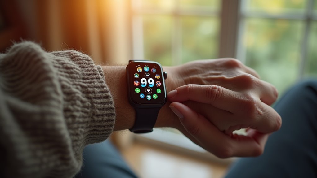
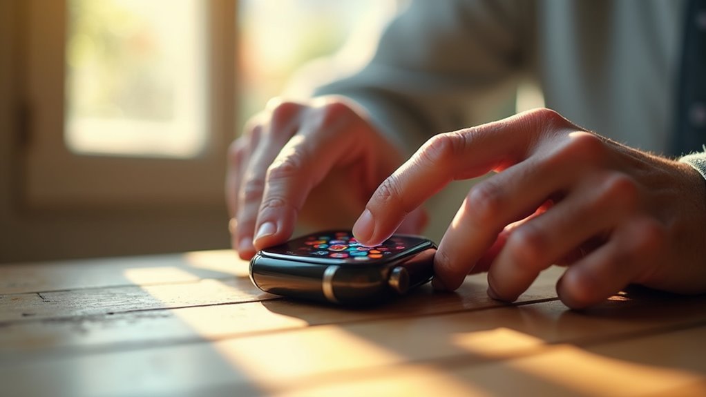
Icon Design and Visual Elements for Better Recognition
Although smartwatches offer countless features through tiny digital icons, older adults often struggle with these miniature visual elements that weren’t designed with aging eyes and cognition in mind.
You’ll find that simple design changes can dramatically improve your smartwatch experience.
Your device’s icons should prioritize clarity through these essential elements:
- High contrast and larger sizing – Choose icons with bold color differences against backgrounds and guarantee they’re large enough for easy recognition.
- Simple, familiar designs – Stick with standardized symbols you already know rather than abstract representations.
- Clear text labels – Enable labels beneath icons using plain language and legible fonts.
You’ll also benefit from adequate spacing between icons to prevent accidental taps and consistent placement patterns that reduce confusion during navigation. Research shows that young old participants respond more favorably to smartwatch applications than their older counterparts.
Display Orientation and Layout Optimization
Three fundamental adjustments to your smartwatch’s display orientation and layout can transform a frustrating experience into an accessible one.
First, enable rotating or swiveling displays that let you tilt the watch face for ideal viewing angles. You’ll reduce arm twisting and wrist strain while finding your perfect position. Second, choose portrait orientation for taller, easier-to-read text layouts that many older adults prefer. Third, implement auto-rotate features that seamlessly adapt to your movements.
| Layout Element | Recommendation | Benefit |
|---|---|---|
| Screen Functions | Maximum 3-4 per screen | Reduces cognitive load |
| Primary Info | Center/up-front placement | Immediate visibility |
| Touch Targets | 10-12mm minimum size | Easier interaction |
| Menu Structure | Consistent, familiar design | Preserves confidence |
Your customizable orientation settings eliminate visibility struggles entirely. Consider devices with relatively large displays that enhance readability and provide easier navigation for older users.
Anti-Glare Technology and Outdoor Readability Solutions
Because bright sunlight can turn your smartwatch into an unreadable mirror, anti-glare technology becomes essential for maintaining clear visibility throughout your day.
This technology diffuses and scatters light, reducing reflections while improving contrast in bright outdoor conditions.
Several solutions can enhance your smartwatch’s outdoor readability:
- Anti-glare screen protectors – Tempered glass protectors with matte coatings scatter light and reduce reflections.
- High brightness displays – Advanced brightness settings automatically adjust to combat intense sunlight.
- Ambient light sensors – Smart technology adapts your display’s brightness based on surrounding light conditions.
You’ll experience reduced eye strain and improved comfort when these technologies work together. These anti-glare solutions are particularly essential for users who frequently find themselves in bright outdoor settings.
Position your smartwatch to avoid direct sunlight when possible, and consider models with adaptive brightness features that automatically optimize visibility based on your environment.
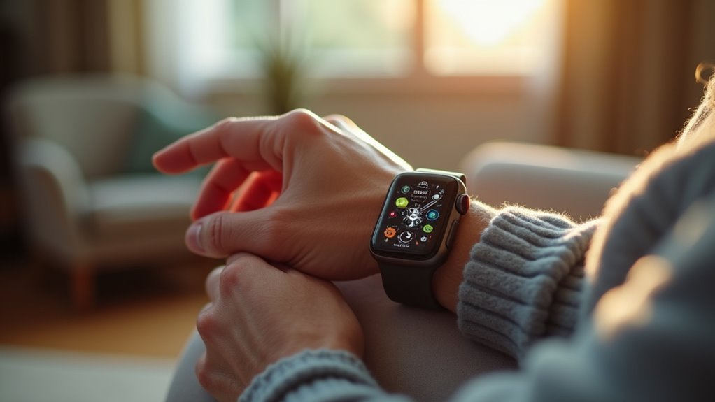
Customizable Interface Elements and Accessibility Settings
When you can adjust your smartwatch’s interface to match your specific visual and physical needs, technology transforms from a barrier into an empowering tool.
Larger font sizes and high-contrast color options greatly improve readability, especially if you’re dealing with visual impairments or age-related eye changes. You’ll find that bold, sans-serif fonts with adjustable spacing reduce eye strain and enhance character recognition.
Bold, high-contrast fonts with adjustable spacing transform your smartwatch display into a clear, readable interface that reduces eye strain.
Simplified menu navigation with fewer layers and larger tap targets prevents frustrating mis-taps. Look for watches offering voice control, text-to-speech capabilities, and compatibility with hearing aids or other assistive devices.
Customizable vibration intensity and alert sounds guarantee you won’t miss important notifications. The Apple Watch stands out among wearable options with features specifically designed for older adults. These accessibility features work together to create a personalized experience that adapts to your changing needs.
Frequently Asked Questions
How Can Doctors Help Encourage Smartwatch Adoption Among Older Adults?
You can encourage smartwatch adoption by providing hands-on demonstrations during appointments, explaining health-focused features like fall detection, offering structured follow-up support, and collaborating with family members to extend education networks.
What Health Metrics Are Most Important for Older Adults to Track?
You should prioritize tracking blood pressure, heart rate, and glucose levels daily. Monitor your grip strength weekly to assess muscle function. Check cholesterol levels monthly and maintain regular activity tracking for thorough health management.
Do Older Adults Worry About Privacy When Using Smartwatches?
You typically don’t prioritize privacy concerns as heavily as younger users. You’re often more focused on usability and comfort, though privacy awareness is growing as smartwatch adoption increases among your age group.
How Long Does It Take Seniors to Learn Smartwatch Basics?
You’ll find limited specific data on learning times, but studies typically use 3-day periods for seniors to assess smartwatch basics. Learning duration varies considerably based on individual abilities and interface complexity.
Can Smartwatches Replace Regular Doctor Visits for Health Monitoring?
You can’t replace regular doctor visits with smartwatches alone. While they’ll track your essential signs and provide valuable health data, you’ll still need healthcare professionals for diagnosis, treatment decisions, and specialized care.
In Summary
You’ll find that implementing these smartwatch readability improvements transforms your daily experience. By adjusting font sizes, enabling high contrast modes, and optimizing screen brightness, you’re creating a more accessible device. Don’t overlook customizing icons and layouts to match your preferences. These accessibility features aren’t just conveniences—they’re essential tools that’ll help you stay connected and independent. Take time to explore your smartwatch’s settings and make these adjustments work for you.

Leave a Reply